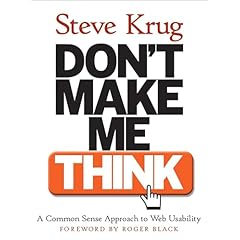
Web Site Design - softer topics are important too
By Andrew Pollack on 11/13/2006 at 10:59 AM EST As someone who reads this site you know how much help I need when it comes to designing attractive, usable web sites. Technically I can make a site do whatever I want. The problem is making it do all the wrong things.
I picked up Steve Krug's book "Don't Make Me Think" to get some perspective on this issue. It's pretty good, and about 90% of what I wanted it to be. The only thing really missing from my perspective is any discussion of color schemes and font choices. I've got that information from other sources, but I think it should be in the book. In all other respects, its a terrific book and you'll see the impact of it's advice on this site in the future. The chapters are focused, concise, short, and well illustrated. They also cover some really solid thinking about how people use web sites and what you can do to make them more effective.
One of the most important pieces of advice I'm taking from Steve, is from page 34 where he discusses the use of 'conventions'. Krug makes the point that conventions may be tedious and boring to develop and not so exciting to look at -- but that's ok because they're helpful and make users more comfortable. As he says, "...praise from peers, awards, and high-profile job offers are rarely based on criteria like 'best use of conventions." I'm guilty as charged here, of reinventing the wheel rather than using a common convention or two.
Time to get busy.
our Notes 8 customers....
Other Recent Stories...
- 01/26/2023Better Running VirtualBox or VMWARE Virtual Machines on Windows 10+ Forgive me, Reader, for I have sinned. I has been nearly 3 years since my last blog entry. The truth is, I haven't had much to say that was worthy of more than a basic social media post -- until today. For my current work, I was assigned a new laptop. It's a real powerhouse machine with 14 processor cores and 64 gigs of ram. It should be perfect for running my development environment in a virtual machine, but it wasn't. VirtualBox was barely starting, and no matter how many features I turned off, it could ......
- 04/04/2020How many Ventilators for the price of those tanks the Pentagon didn't even want?This goes WAY beyond Trump or Obama. This is decades of poor planning and poor use of funds. Certainly it should have been addressed in the Trump, Obama, Bush, Clinton, Bush, and Reagan administrations -- all of which were well aware of the implications of a pandemic. I want a military prepared to help us, not just hurt other people. As an American I expect that with the ridiculous funding of our military might, we are prepared for damn near everything. Not just killing people and breaking things, but ......
- 01/28/2020Copyright Troll WarningThere's a copyright troll firm that has automated reverse-image searches and goes around looking for any posted images that they can make a quick copyright claim on. This is not quite a scam because it's technically legal, but it's run very much like a scam. This company works with a few "clients" that have vast repositories of copyrighted images. The trolls do a reverse web search on those images looking for hits. When they find one on a site that looks like someone they can scare, they work it like ......
- 03/26/2019Undestanding how OAUTH scopes will bring the concept of APPS to your Domino server
- 02/05/2019Toro Yard Equipment - Not really a premium brand as far as I am concerned
- 10/08/2018Will you be at the NYC Launch Event for HCL Domino v10 -- Find me!
- 09/04/2018With two big projects on hold, I suddenly find myself very available for new short and long term projects.
- 07/13/2018Who is HCL and why is it a good thing that they are now the ones behind Notes and Domino?
- 03/21/2018Domino Apps on IOS is a Game Changer. Quit holding back.
- 02/15/2018Andrew’s Proposed Gun Laws


does shorten it and makes it more efficient or you may say more dense. Hence,
there is a profit from using them - if they are used in a correct way and not
ABused.